

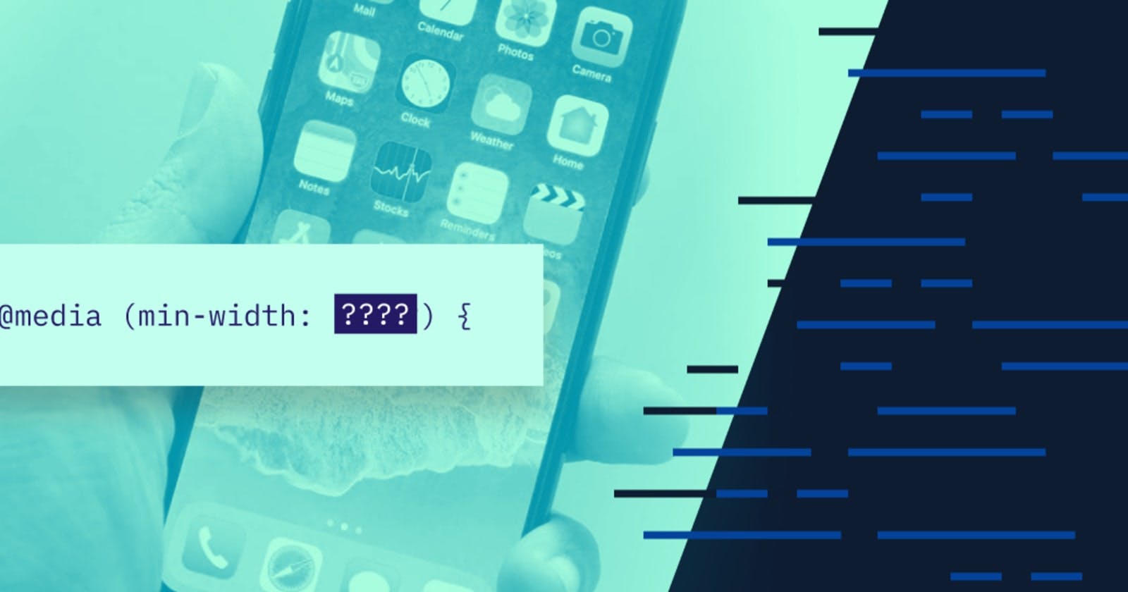


In this article, we would be talking about breakpoints, breakpoints are the viewport width at which we want our design to change. In other words, where we want to put our media queries.
No matter what we decide, about going mobile-first or desktop-first, one thing that is for sure is that we have to select breakpoints for our design.
For me, there are three major ways of selecting breakpoints:
- The Bad Approach
- The Good Approach
- The Perfect Approach
The Bad Approach
Unfortunately, the bad way is also the most used way of choosing breakpoints, and it consists of simply using the width of popular devices as the breakpoints.
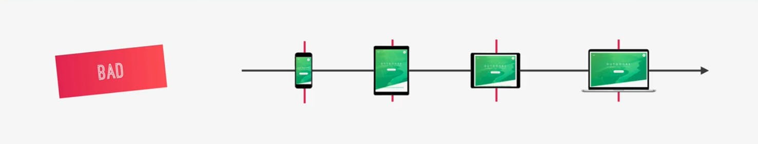
Designers really like to use apple products like the iPhone, and the iPad, to set breakpoints for their screen width. While this is the easiest way, it has a couple of problems:
- First, you’re optimizing for one very specific device, ignoring all the users of other devices, which may be even more used than the apple products.
- Second, and even more important is that this strategy is not future proof at all. If tomorrow apple decides to completely change resolution in all their devices, would you go ahead to change all your media queries on all the projects that you’ve ever built? I don’t think so, right?
- This approach is completely against the logic of reusable and maintainable codes.
Now, of course, it’s okay to use this strategy if you’re just starting out with responsive design and just want to learn how it works.
The Good Approach
If you want to get more serious, it’s time to move on to a better way, which I like to call the good approach.
In this approach, we look at all the most-used device width on the entire internet, try to group them together in a logical way and way and then pick our breakpoints from that.
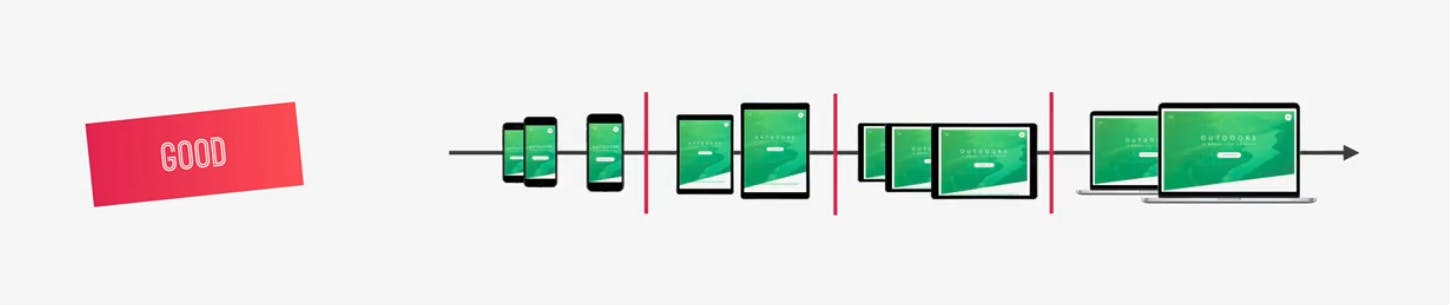
And while it’s still not ideal to use real devices to figure out breakpoints, it’s already a lot better than the first approach, because we’re using a lot of devices, and we’re also using the most popular device width.
Plus, we’re not setting breakpoints at one specific point but between similar device width.
The Perfect Approach
Alright, now the perfect approach to do this is to ignore devices all together and only look at your content in your design.
So, ideally, it works like this; you begin at one size, either mobile or desktop and then start increasing your screen width or decreasing for desktop-first.

Then, as soon as the design breaks which means that the design no longer works, it no longer looks okay, then you insert a new breakpoint, and that’s it.
Again, you just put the breakpoints wherever your design starts to look weird and out of place, and don’t think about devices at all. The thing with this approach is that it can be extremely difficult. That’s why not many people are doing it.
Without the constraints of at least a couple of pre-defined breakpoints, it is hard to find the best breakpoints and you might end up with a bunch of breakpoints.
You should totally try this perfect approach in your future projects, you really should. It’s a great exercise to design/develop without the constraints of having pre-defined breakpoints.
Digging Deep Into Breakpoints With The Good Approach
Now, that you are familiar with the three major ways of selecting breakpoints, let’s dig deep with the second approach that I showed you, we start with the most-used screen size that we can get from an app called StatCounter . This data is freely available on the internet.
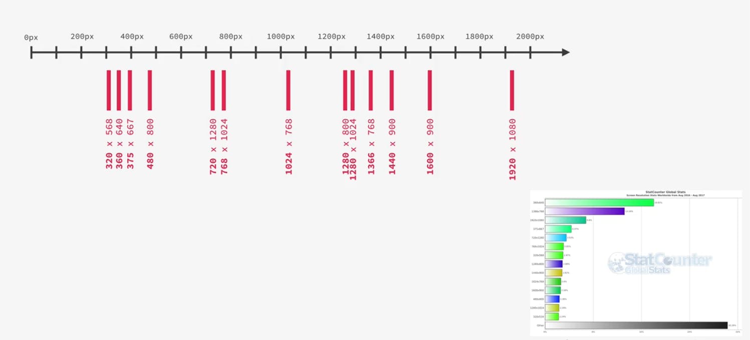
This one is for the range between November 2019 and November 2020. But, if you’re reading this post in 2021, 2022 or even 2023, these stats will probably not have changed that much.
And, even if they did, you can just use this strategy with the new screen sizes and select your breakpoints from there. Anyway, in this diagram, I just plotted these most-used screen sizes that you can see in the chart up there.
So, from the diagram above, you can already see pretty good how we could group these screen sizes. Right?
Usually, we’ll need one breakpoint for phones, one for portrait tablets, one for landscape tablets and one for the desktop. There can be more, of course, but these are the basics.
So, where do you think these breakpoints should be, based on the diagram? Here is how I would position them.
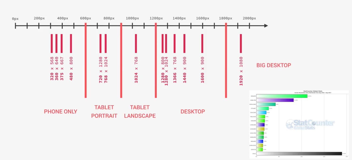
So, the phone ranging from 0px - 600px, from 600px - 900px the portrait tablets, from 900px - 1200px the landscape tablet, and from 1200px - upward for the desktop.
I actually even included a breakpoint for big desktops starting at 1800px. But, that one is not really mandatory, It’s just if we want to give users with these huge screens something special.
This could be different, of course, it’s actually a bit subjective. But, as long as it makes sense, and it does I think, then it’s great. Now, just to give you some perspective, these are the iPhone, iPad portrait and landscape, and MacBook Pro 15 inch.
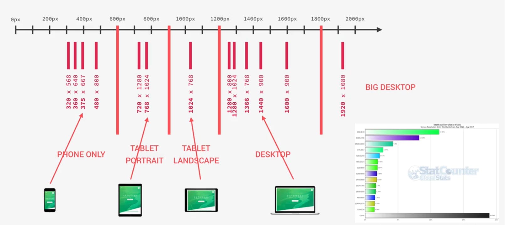
It is totally okay, to call this iPhone, or iPad, or MacBook. In fact, we can and should use these devices to test our responsive designs.
What we should not do though, is to just use their width as breakpoints, which we already talked about.
Conclusion
Alright, and that’s it for this post. I hope it made a lot of things clearer to you. And now, all you have to do is to actually implement these media queries.