


Two fundamental aspects of modern responsive designs are, without a doubt, deciding about doing mobile-first or desktop-first for a website or app, as well as selecting breakpoints for the project when writing media queries. So in this article, that’s what we’re going to talk about.
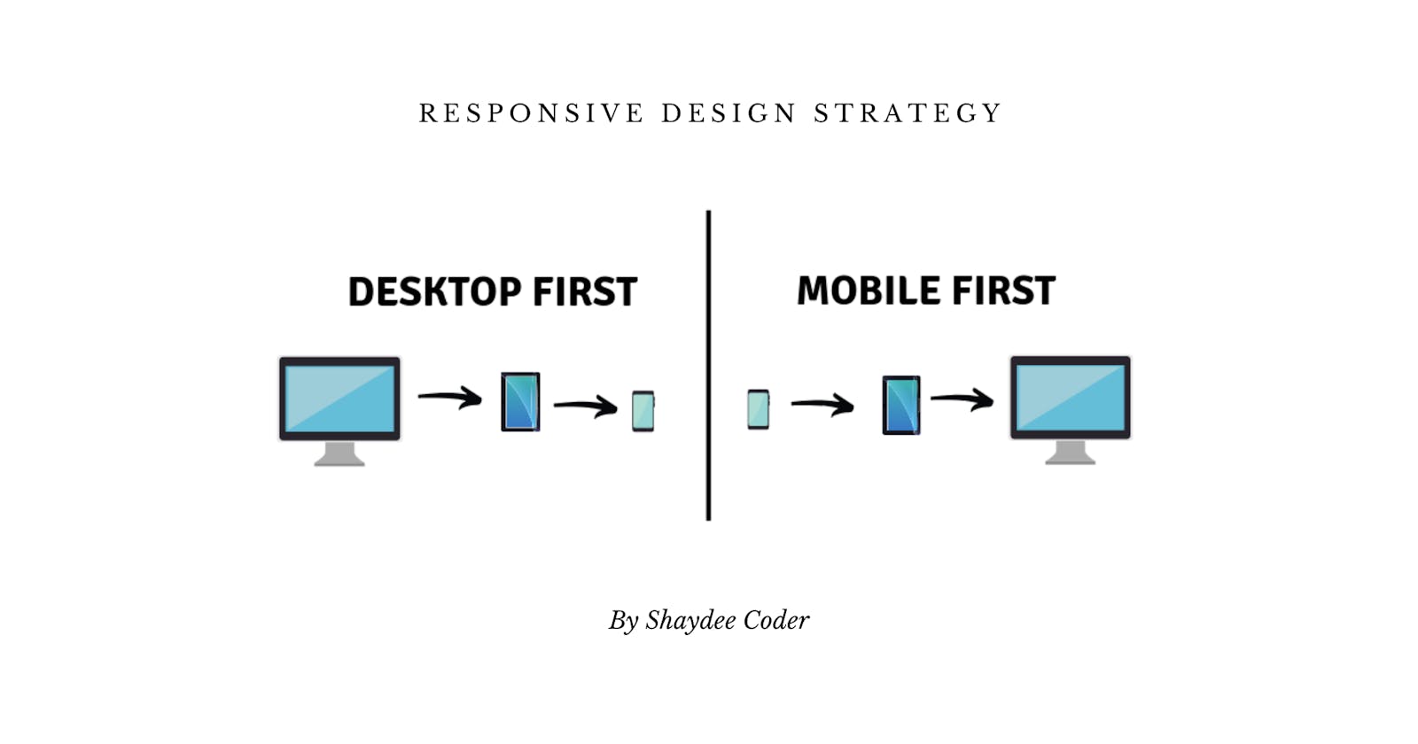
Desktop-first Vs Mobile-first
In the desktop-first strategy/approach, we optimize our interfaces for the large screens. We start by writing CSS code for these large screens, into our CSS file. Then later, we write media queries in order to shrink the design to fit smaller screens.
This is the more traditional way of making a responsive design, and also the easier way to practically learn responsive design, in my opinion. The way we do this, is by writing media queries that test for max-width.
If that’s confusing, don’t worry I will explain it as we move along. But for now, let’s see how the mobile-first strategy/approach is different.
In the mobile-first, we start by writing CSS code for smaller screens in order to optimize for mobile, and then, move up to larger screens using media queries that test for min-width. It’s basically just the opposite work flow of the desktop-first strategy.
The philosophy about this strategy is that we the designers/developers really have to think about the mobile experience, by reducing our websites or apps to the absolute essentials, stripping away everything that isn’t really necessary, in order to end up with a smaller and faster final product.
We are going to discuss this a bit more in a second, for now, let’s move on to the more technical and more exciting aspect of responsive design.
Types Of Media Queries
Since we are talking about desktop-first and mobile-first strategies, this is an excellent time to talk about the difference between the types of media queries that we have to write for each approach.
- Max-width (for desktop-first)
- Min-width (for mobile-first)
Max-width
You may have been using max-width media queries, but without really understanding how they work. Let’s clear that up right now.
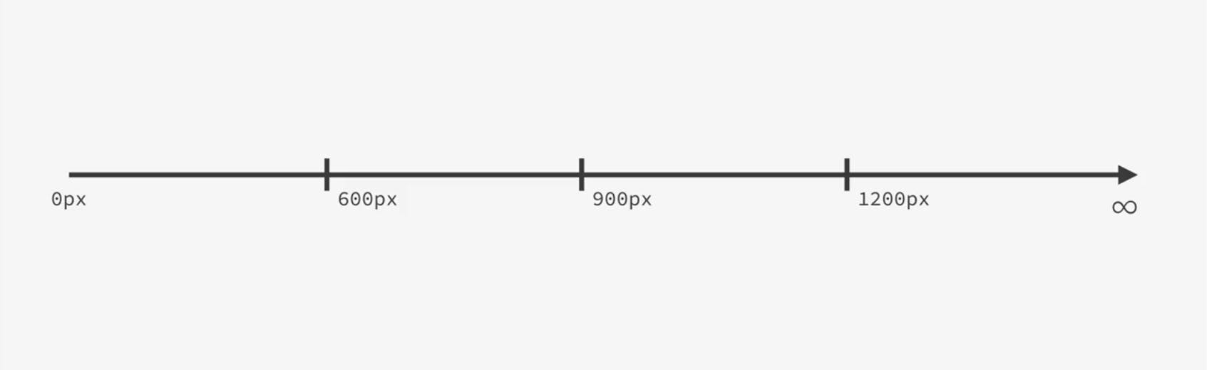
So, as an example, we have in the above diagram a pixel spectrum going from zero to infinity, with a couple of breakpoints, which are, 600, 900 and 1200 pixels.
Let’s start with desktop-first, remember that we start by writing CSS for larger screens, and so, our initial code will be on the right size of this spectrum. Now, in order to to adapt our design to smaller screens, we will write max-width media queries, like this one:
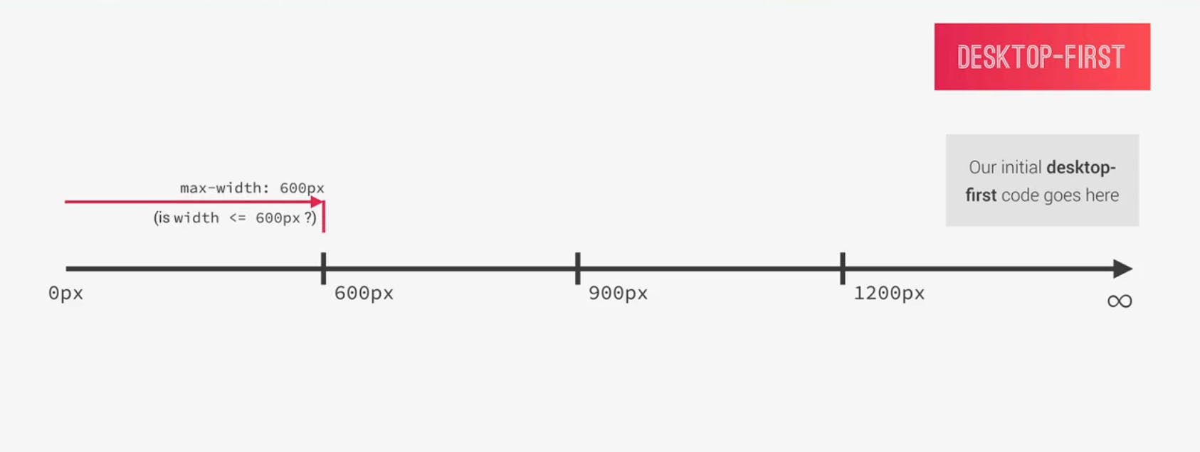
When we use max-width of 600px, what the media query does is that it basically checks if the current viewport width i.e. device width is smaller or equal to 600px.
If it is, then all the CSS code in this media query will apply or be applied, and if not, that specific code won’t apply or be applied to the page. What this means is that the maximum width at which the media query works or applies is 600px, and after that, it stops working.
Now, in these media queries, what we do is just override some specific parts of the global CSS code i.e. only the parts that we want to change, because all the rest of the global code would still be applied to the page, in other words, inherited by the media queries.
So, think of media queries as tools for overriding specific parts of our CSS for specific viewport width or device width.
This concept is the same for all media query breakpoints, and so works for the next breakpoint and the next media query which is max-width: 900px in this case.
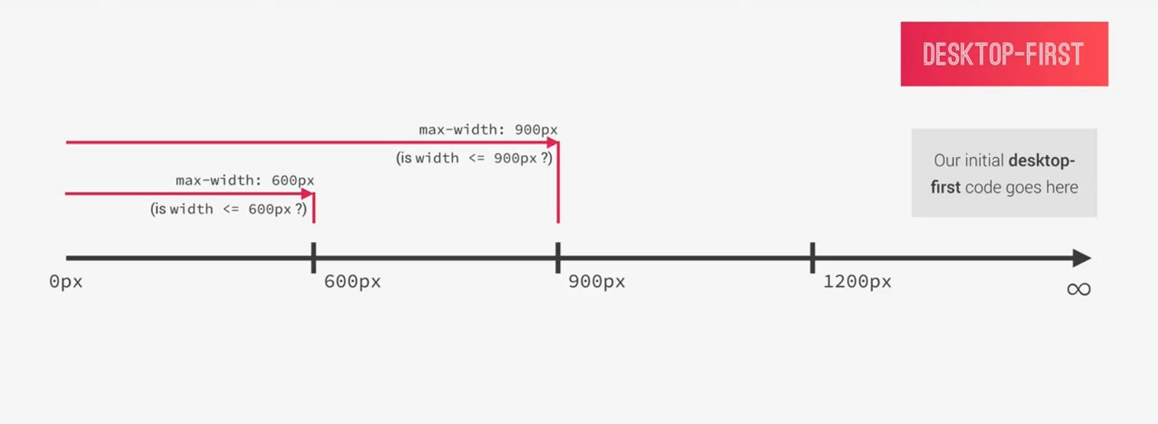
All the code in this media query will work or apply because the width is now less or equal to 900px. In other words, as long as the maximum width is 900px, all the code in that specific media query would be applied to the webpage or app.
Now, you might be wondering, what if a phone has a width of 500px? Which of the media queries would be applied?
That’s an excellent question, and the answer is actually pretty simple. Both media queries would be applied, the reason is because both conditions are true.
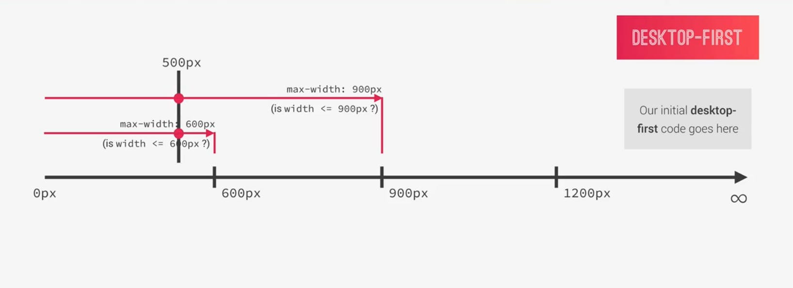
500px is less than 600px, and also less than 900px, so the code in both media queries would be applied.
Now, if you have any conflicting CSS rules in these queries, which is usually the case, like defining the global font size in both media queries. Then the one which appears less in the code is the one that takes precedence.
That’s because media queries don’t give importance or specificity to our selectors. So, the order of the code matters a lot, which is why we keep our media queries always at the end.
But don’t worry, if this sounds overwhelming right now, you will understand why it is like this when you read more on how CSS works behind the scene.
So, let’s complete the example with the last breakpoint, here is how the media query looks for a 1200px.
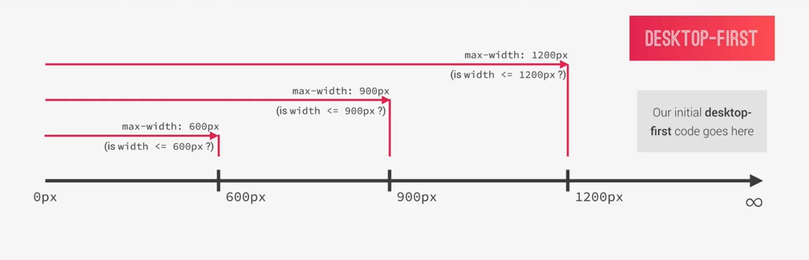
In this example, 1200px is the width at which we will start doing some changes in our media queries. Above 1200px, we have the desktop version of the project, outside of any media queries.
Okay, with this example, we have the full picture of this example project, with the desktop-first approach.
Min-width
Let’s now look at the mobile-first approach, where our initial CSS code is obviously on the left-side of the pixel spectrum, where the mobile phone screens are.
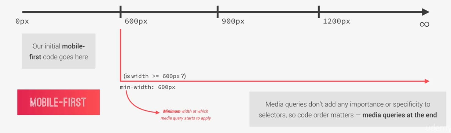
In the desktop-first, we had max-width media queries, but now, in the mobile-first we have min-width media queries. So what does min-width: 600px; mean?
It’s basically asking the question, is the current viewport/device width larger or equal to 600px. If so, then the code in that media query would be applied to the page.
It’s called a min-width media query, because 600px is the minimum width at which the media query starts to apply.
Visually speaking, this basically translates to a pixel range starting from 600px covering all the way until infinity.
We have to use this type of media query in the mobile-first approach because we want the queries to stay away from our smallest screen styles. In other words, we don’t want the CSS code in this query to be applied to the smaller screens, just the bigger screens. You can see that very nicely, with the arrow in the above diagram and the pixel range that each media query covers.
For the remaining two breakpoints the logic is pretty much the same.
So, for the 900px breakpoint, we will have a min-width: 900px; media query which would be activated if the viewport width is larger or equal to 900px. And, the same for 1200px.
Now, how do you decide what strategy/approach to use?
Well! It depends on your unique situation and project. One major disadvantage of the mobile-first approach is the fact that clients are used to seeing a desktop version as a prototype.
Conclusion
Each project is a project, and in each case in the end it’s you who have to decide what’s best. No matter what you decide, always keep both the desktop and mobile versions in mind, and understand that they are both important.
I hope this helped you, I didn’t get around the different options in selecting our breakpoints, this article is getting too long, so maybe that’s a subject for another day. If you have any questions, feel free to add them in the comments.
If you like the contents of this post and would like to get more contents as this, subscribe to my newsletters at the very top of this article so you’d be notified whenever I post a new article, and don't forget to share.