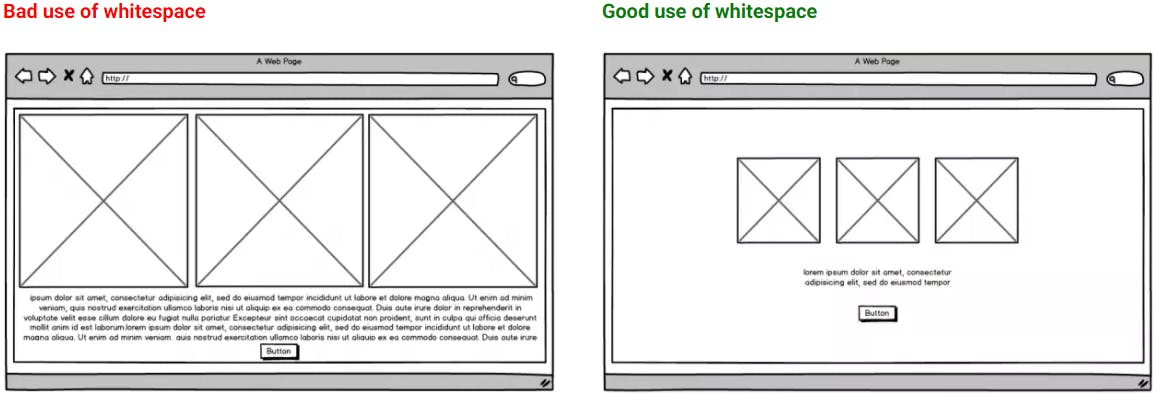
When designing a new website it’s essential to keep your pages clean, uncluttered, and easy to navigate. Today's website visitors are content-scanners. They scroll quickly, skim posts, and get distracted by busy layouts trying to accomplish too much. The key to getting your visitors' undivided attention is simplicity -- and that starts with an effective use of whitespace.
In this article, we'll take a brief look at why whitespace matters, what it means for conversion-driven web design, and how to properly use whitespace to lead website visitors towards the desired action.
What is Whitespace in Web Design?
Whitespace in web design also known as negative space is the space within any design that doesn’t contain any screen element and won’t attract the attention of the user or reader. It does not literally mean an empty space with a white background. It can be of any color, texture, patterns or even a background image.
It is the portion of the page left unmarked that separate each website content; the space between elements in a composition such as margins and gutters. It can be seen between columns, between lines of text or figures, buttons, images and videos, that provides visual breathing room for the eye.
Why is Whitespace Important?
One of the most frustrating feelings is when there is too much content on a website and all of it is fighting for your attention without a clear and consistent separation.
Crowded and very busy websites are very difficult to read, making the users feel frustrated trying to find the right part of the page they’re interested in. It has been long understood that people are mostly scanning the content before they decide to read it. Whitespaces take a big part in making content scannable, which makes it more engaging.
Whitespace also gives you an impression of a higher quality design. Websites that use whitespace seem to be more elegant and lighter. It has been a well-known practice within luxury brand websites to have larger whitespaces, making the designs look more elegant.
Whitespaces are also often used for balancing the layout, bringing the visual integrity of the design.

Types of Whitespace
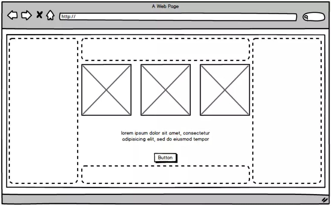
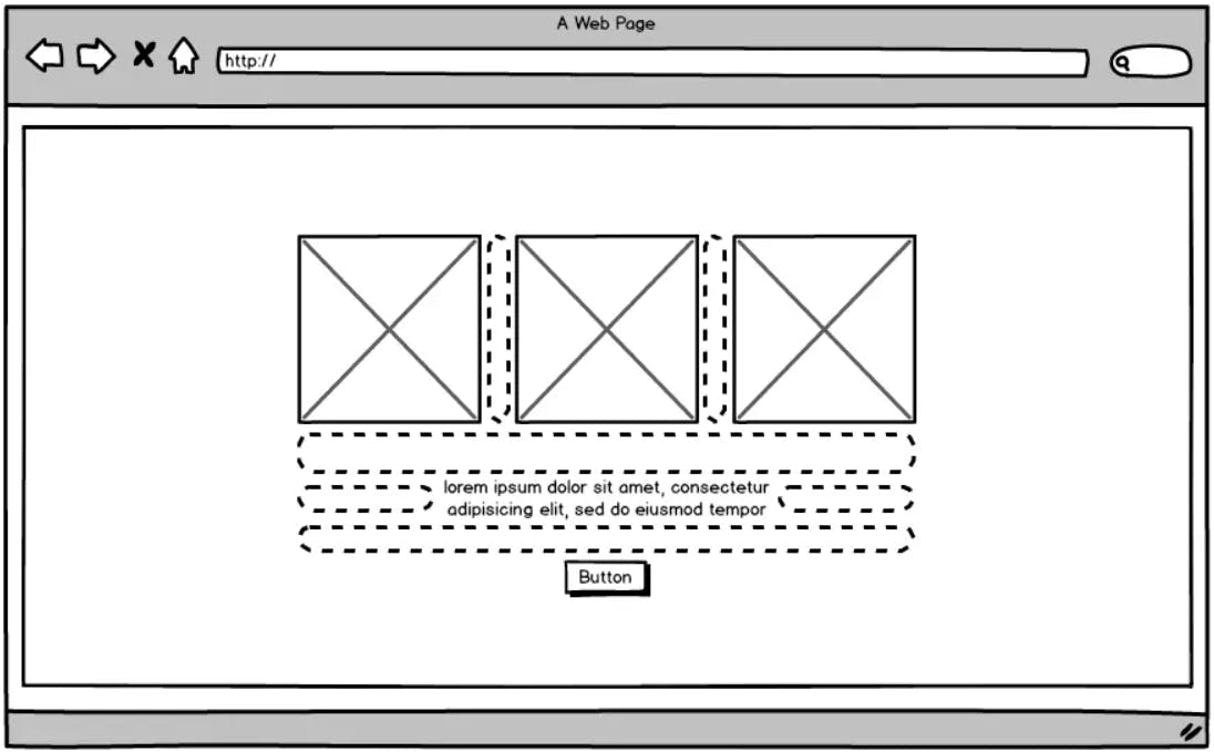
There are typically 2 different whitespace types that you will find in web design: macro and micro whitespaces.
- Macro It is a space between groups of elements. Mostly it is a space within a section that is around the section content. Just to give you an idea of the macro whitespace, let’s bring it to a context of a web page. Let’s assume that your page has multiple different sections, such as the introduction section and a news section. Macro whitespace would be the space between the sections that would allow you to easily scan the content of the page, to see what section the information is related to.
- Micro Micro spaces are smaller whitespaces within the content. Those would normally be your paddings, margins and line-heights that define the micro spaces between titles, paragraphs, buttons, images, etc. within a group of elements. Bringing it back to the context if that was your news section on the web page, micro whitespace is your space between the title, image and paragraph, and even more so, it is a space between each line of the paragraph text, allowing you to read with more ease and bringing you the lightness and elegance to the design.


There’s another way to categorize negative space by the way it draws attention or not. There are passive space and active space.
Passive space is the space between small objects that goes unnoticed. The designers use it to create texts or arrange paragraphs or icons. Though it goes without being noticed, this white space is intentionally added there in a very subtle way, to allow the eye to easily read the design/text.
On the contrary, active space is used to draw a user’s attention and to emphasize certain elements like a headline, logo or graphic.
Macro space is always used intentionally to create more focus on a certain area, so we can say that macro space is an active space.
Consistency
Whitespaces must be used consistently throughout the whole page. Especially when talking about micro whitespace. If you are having number a of pixels set from your title, the users will be expecting to see the next paragraph or a section title having the same space, having different size whitespaces will on the other hand bring confusion and frustration.
Conclusion
As a conclusion, I would like to add that a very good approach to using whitespaces is to perceive them as an active element on the website. Whitespaces are there to help with scanning the content, readability, make websites seem more elegant and improve user’s experience. So next time you feel that the whitespace has got to be filled with some content, think of it as an active website element, instead of a blank background, and use it consistently.

